'Putto Poised on a Globe' made manifest of unbaked clay, by Andrea del Verrochio, in 1480, and Mark Rothko's 'Chapel Murals', 1962-1967, oil on canvas, both exhibit a variety of design(p.121) principles. These principles are supported by design elements to create dynamic works of art. Both artists employ emphasis, balance(p.125,which refers to the visual weight), unity and variety(p.123) to direct the viewers eye and to evoke certain stimuli.
Verrochio invites the viewer's eye to the unknown space explored by Putto's decisive lines and focused eyes. The unknown space would be the actual emphasis(p.134) or focal point of this piece. Rothko uses a warm analogous color harmony(p.100), whereas, the colors used are adjacent to one another of the color wheel, to evoke an emphasis of the shifts in light over the picture plane to create a floating sensation in the piece. The placement of the lines and colors used, in both pieces, contribute to the unity or sense of oneness throughout the artworks.
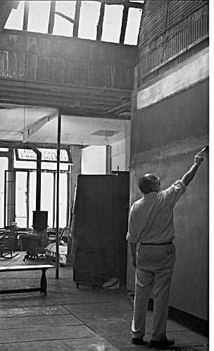 (Rothko at Elkan Studio)
Both artists use visual harmonies or unity(p.122). Verrochio uses a consistent rhythm of upward flowing diagonal lines, while Putto's leaning gait enforces the same discernable visual rhythm(p.143) harmony. In Rothko's 'Chapel Murals', Rothko used color to unify the space in the pieces. He paints a pattern of dynamic warm values which seem to float above the picture plane. This unity is also reliant upon the rhythmic placement of the various sized shapes.
However different their approach, both artists used many of the same principles of design.
All page numbers are in reference to terms found in Mark Getlein's text, 'Living With Art'.

No comments:
Post a Comment